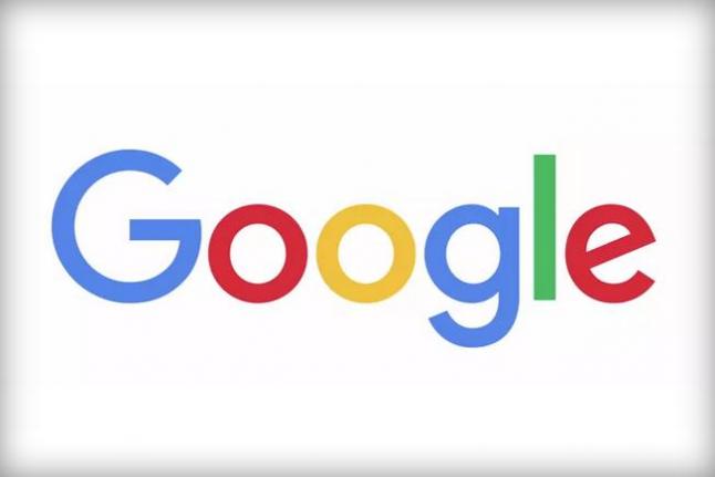
MOUNTAIN VIEW, Calif., September 1, 2015 (UPI) Google introduced a new logo Tuesday, meant to work better across multiple platforms such as desktop computers, smartphones and tablets.
“Today we’re introducing a new logo and identity family that reflects this reality and shows you when the Google magic is working for you, even on the tiniest screens,” the company said in an official blog post. “As you’ll see, we’ve taken the Google logo and branding, which were originally built for a single desktop browser page, and updated them for a world of seamless computing across an endless number of devices and different kinds of inputs” such as tap, type and talk.”
“This isn’t the first time we’ve changed our look, and it probably won’t be the last, but we think today’s update is a great reflection of all the ways Google works for you across Search, Maps, Gmail, Chrome and many others,” Google said. “We think we’ve taken the best of Google (simple, uncluttered, colorful, friendly), and recast it not just for the Google of today, but for the Google of the future.”
Google has also redesigned the lowercase ‘g’ found on browser tabs and smartphone apps. It will now be an uppercase ‘G’ striped in all four of Google’s colors.
The new look was presented in a short animated clip in which a cartoon like hand wipes away the old typeface and draws in the new one. The new logo appears more modern with smaller lettering and softer colors.The new logo is meant to display easier on low-bandwidth connections.
Google’s new look comes less than a month after the company went though some restructuring with Sundar Pichai stepping in as CEO and co-founders Larry Page and Sergey Brin switching over to a larger holding company called Alphabet.
[hdplay id=289]


